Presenting the biggest Apple’s conference
On 2018, I had the honor to design one proposal for Apple’s Worldwide Developers Conference 2018.
The job was requested by an USA marketing agency, the name is under NDA.
The Challenge
Design a landing to create engagement
They want to focus users’ attention on the speaker’s list because they consider the most valuable information about the event.
Pre-requisites:
To use provided images, to follow Apple’s style guide.
My Role
- Identify problem statement
- UX/UI Design
- Data collection
- Stakeholders’ communication
Time
- Two weeks
Date
- 2018
Data collect
Benchmarking
When I started this project I didn’t have any knowledge about how to design a landing page for an Event.
- Who are the users?
- What info is important for users?
- What they’re looking for?
- Why they will check a landing page?
I decided to start looking for landing pages for other big events, to recognize what patterns they use and which information they highlight.
“A benchmarking analysis will show me what are the best features that other markets references are using and work for them”
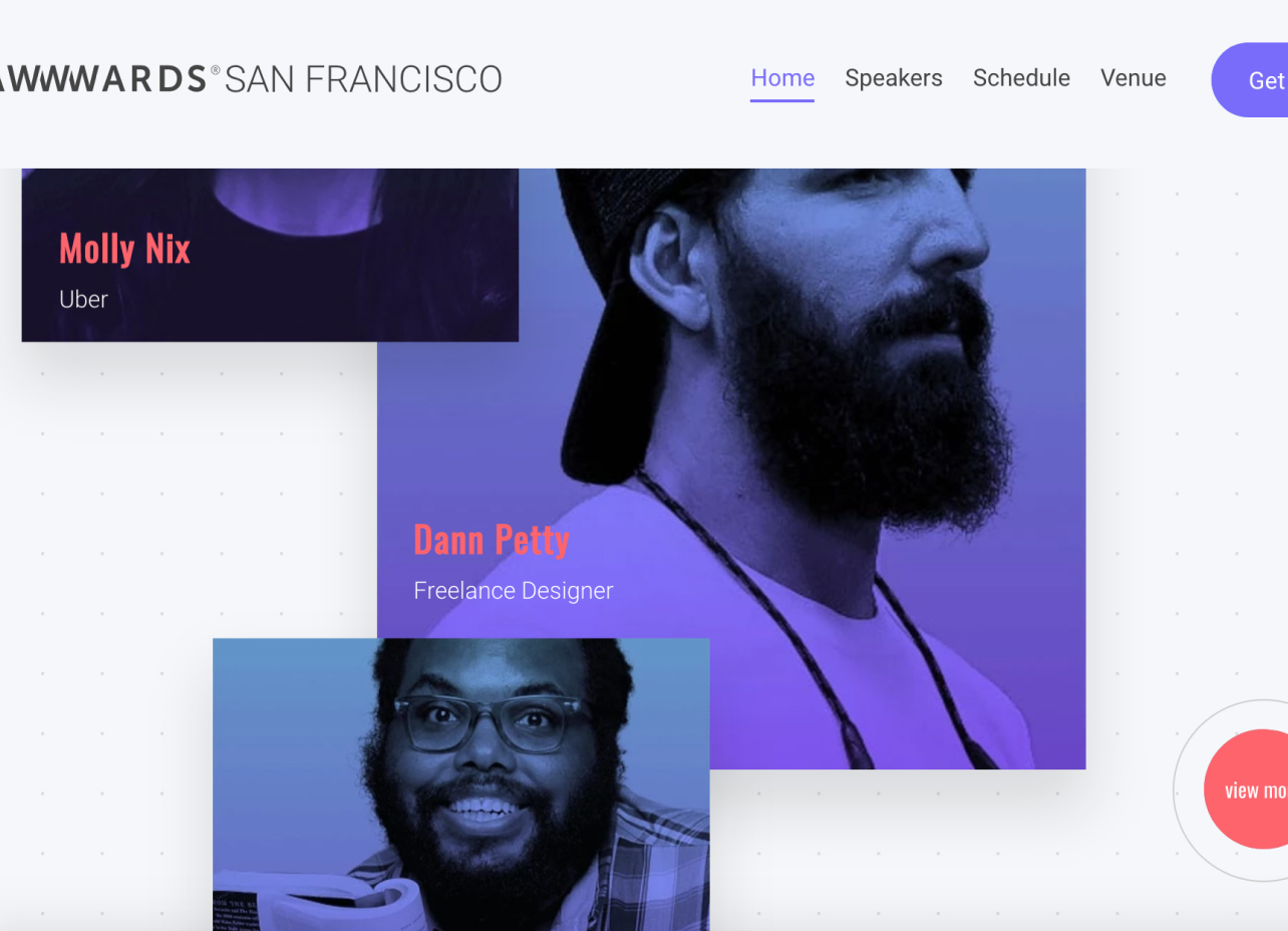
AWWWARDS conference
http://conference.awwwards.com
Great user interaction and visual design!. Great animations that gives life to elements. The speakers’ list on Homepage, each speaker looks like “clickable” but isn’t, more details about the speakers beyond “View more” button. There is also another section for “speakers”, but is not connected to the homepage.
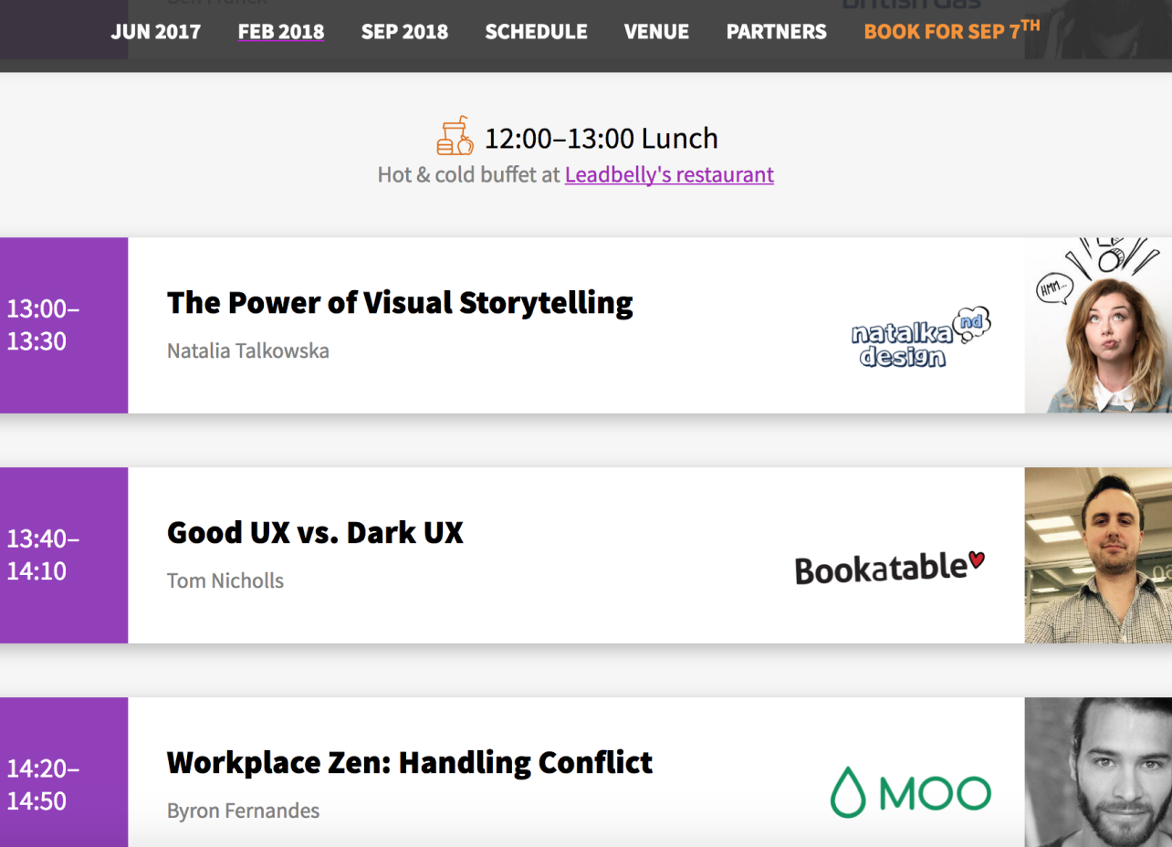
The UX conference
http://theuxconf.com
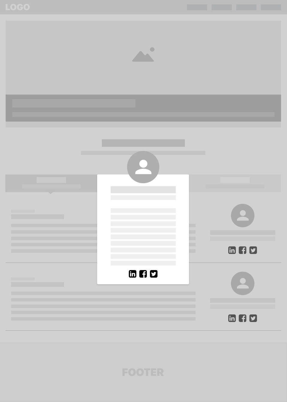
It’s usable and intuitive. The speakers list is integrated with the agenda. Agenda/speakers list on Homepage. A Lightbox is opened, when the user clicks on each speaker, showing more detail about the topic of the talk.
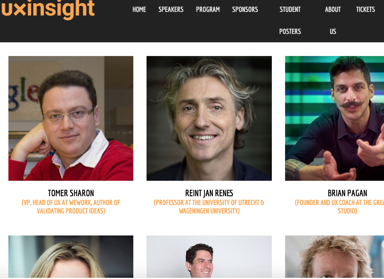
UXinsight conference
https://uxinsightevent.com
Intuitive and well-structured website. Easy to read and navigate.
As a negative point, the user needs to do many steps to get to the information.
The “speakers’ list” page is basic but useful, easy to use. Website NON-Responsive.
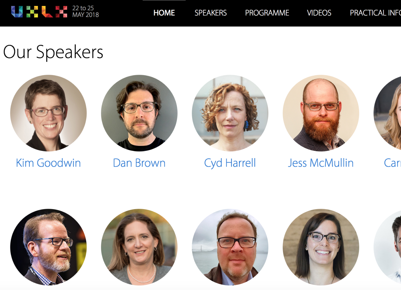
UX LX conference
https://www.ux-lx.com
The users can get the speaker’s list in two different ways:
Homepage, each speaker has an image and name, and a detail page.
Speakers from the menu. Each speaker has an image, name, profession, and a small brief and detail page where the user can see a complete brief and the “topic and date” of the talk that the speaker will present.
Who
Personas
Based on an interview I ran with stakeholders plus the Benchmarking analysis, I had enough information to create our personas. I polished this step with stakeholders.
Personas and user cases help me in the design process to take different kinds of decisions (hierarchize information, features).
Lacie “the designer”
UX/UI Designer at Robotie
Lacie lives with her boyfriend Tomas in Portlandia. She is 28 years old and doesn’t have kids but she wants to have one in the future. She loves to go out with friends to cozy and nice places, she is funny and friendly. Lacie has 3 years of experience in the Tech industry and she wants to improve on her career so she is constantly learning about tech and design (Every morning she takes half-hour reading design news). She is extremely passionate about new design tendencies. She loves to go to conferences to learn new techniques but sometimes she gets bored because she saw the same talk at other conferences. Her life is a bit busy so she needs to save time as much as possible.
Case of use:
Before buying a conference ticket she reads the conference webpage to analyze what topics the speakers are going to talk about, she doesn’t want to lose time and money.
Nicholas “the traveler”
IOS Developer – Freelance
Nicholas is a Digital Nomad: “My house is the place where I felt comfortable”. He has been traveling for almost 4 years now. He loves his free lifestyle and that was the reason why he chose to be a Freelancer. He enjoys running, hiking, surfing.
As an IOS Developer He needs to be informed about the news tendencies in the Apple world, so he often goes to meet-ups and conferences. Their clients are very happy with him: “Nicholas works fast with excellent quality of code, we have excellent communication”. Nicholas wants new challenges, so he is working on a side project as solo-entrepreneur. He doesn’t have marketing experience and he doesn’t know how to monetize and App.
Case of use:
Nicholas has to plan his calendar to be in the right place at the right moment. He needs to analyze If the cost and effort will be worth it. He wants to know iOS and marketing news tendencies, also he wants to be in touch with other professionals.
Alex “the entrepreneur”
Founder of Gadget OK Inc.
Alex is 36 years old and lives with his wife in New York City. He loves the good things of life: food and wine. He has an active social life, but his decisions are always around his career. He has a long trajectory as an entrepreneur, he started working in marketing 20 years ago. During that time, He made a lot of connections that help him to start his own business. Alex is the founder of “GadgetOK.com” a B2C website that connects gadget sellers with customers. His platform sells one million gadgets per month and Apple devices are the top trend in the market. He wants to expand “Gadget OK” to Europe and South America but to do that he needs to do networking, find new investors, and, of course, more employees.
Case of use:
Before buying a conference ticket she reads the conference webpage to analyze what topics the speakers are going to talk about, she doesn’t want to lose time and money.
Discovery & vision
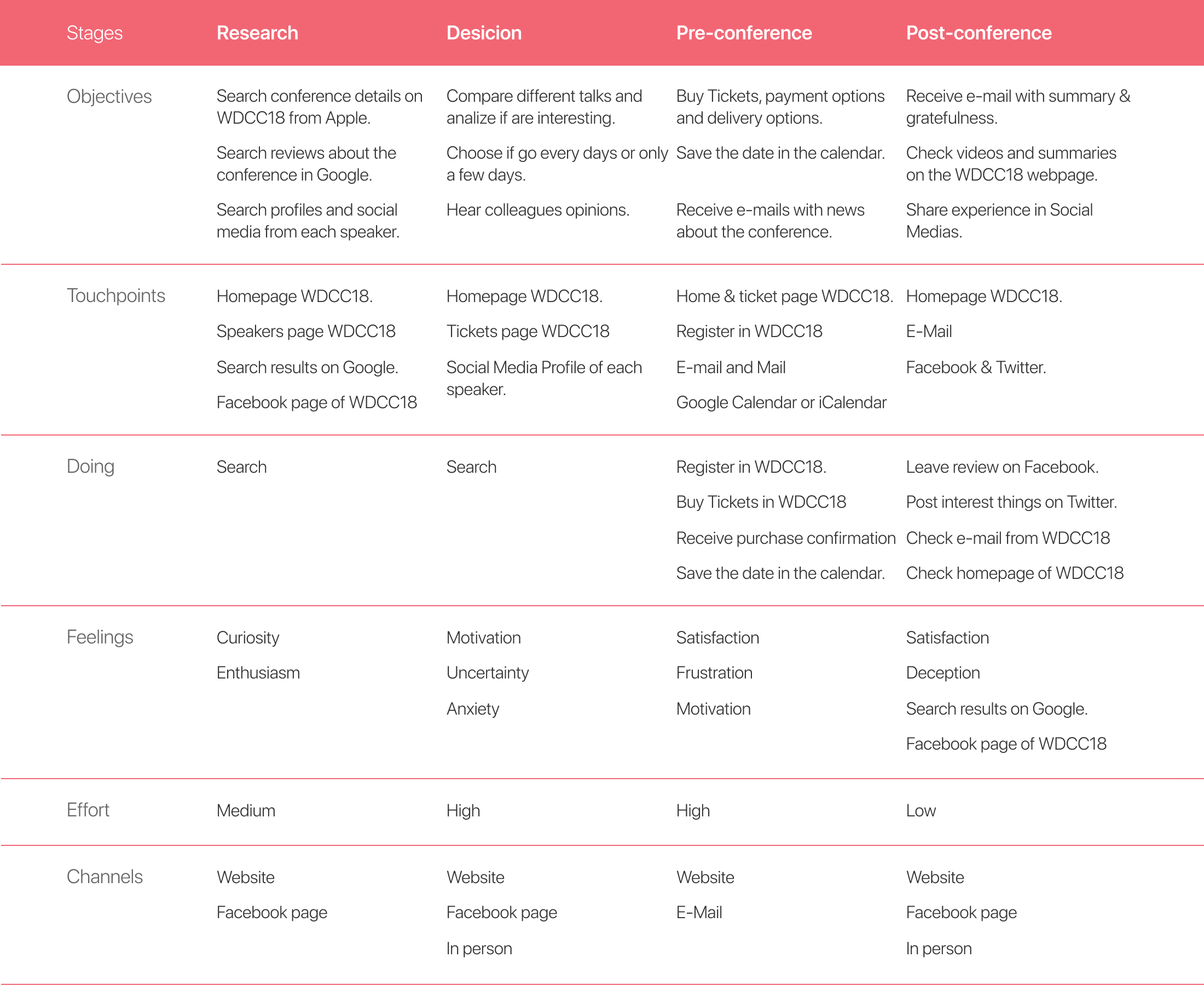
Customer journey
After I defined our “Personas”. I was viable to create the “Customer Journey maps”, That helps to identify the paint-point, user needs and the features that I should focus-on, or at least highlight.
As a result, I should focus my strategic on different interfaces:
- Landing page with: Speakers List, Speaker Detail, Agenda, Register process, Buy Tickets, provide help.
- Promotion channels like Facebook and Instagram
- Following up channels (Newsletters): What is coming, Ticket purchased confirmation, gratefulness
Definition and explorations
Ideas and product alignment
I prepared documentation with my findings to present to stakeholders, also, I bring to the table some Sharpies markers and different “hand-draw” wireframes with ideas of how to approach an effective solution.
We had a session in which we aligned: product needs, constraints and ideas.
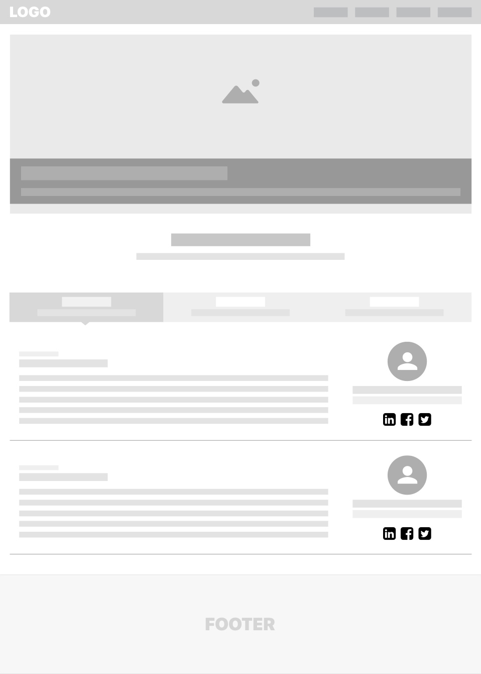
Main wireframes
Before to bring the final high-fidelity solution, I prepared Wireframes as a tentative of how the product will be structured.
Solution
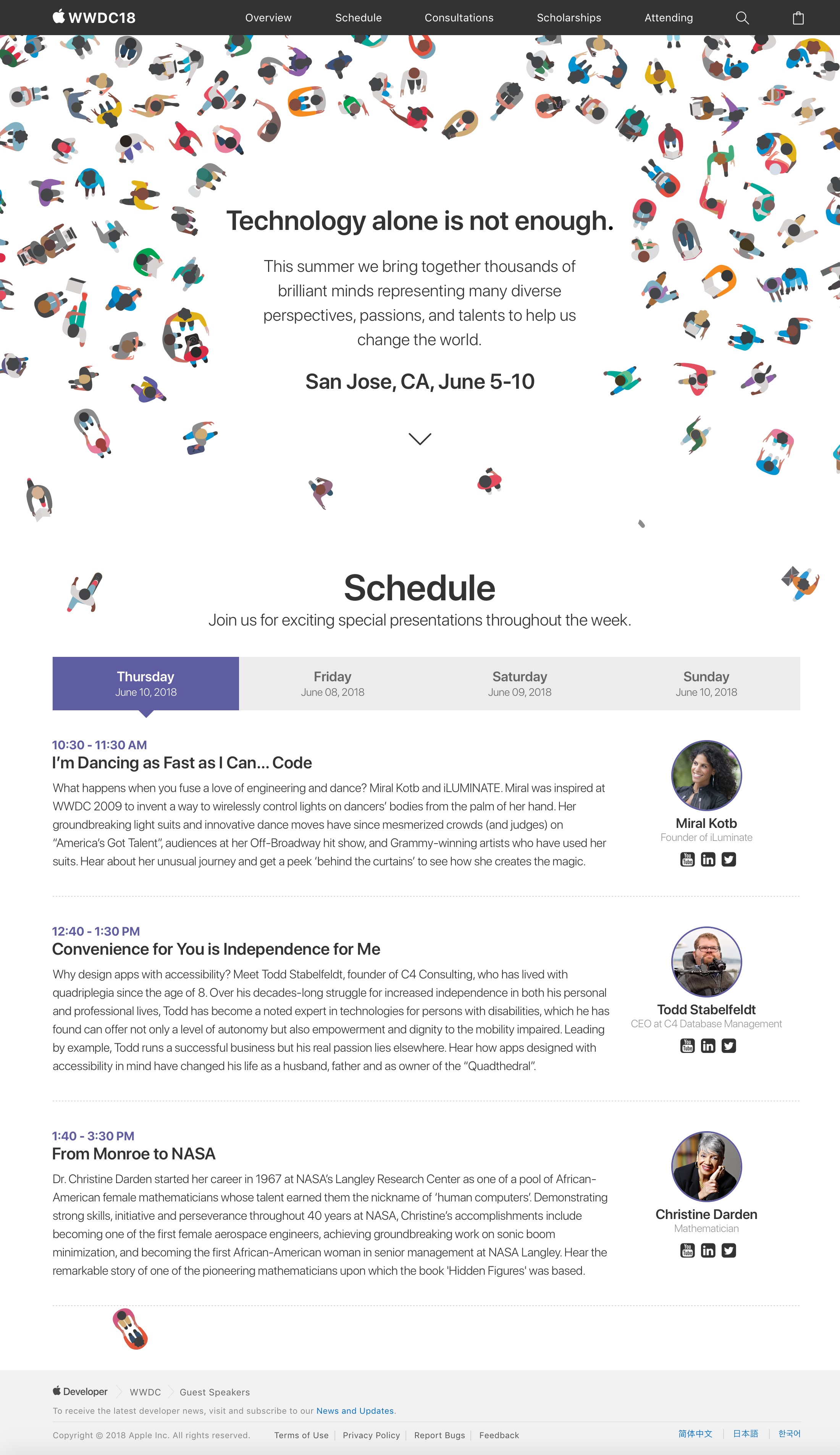
Introducing WWDC 2018 landing page
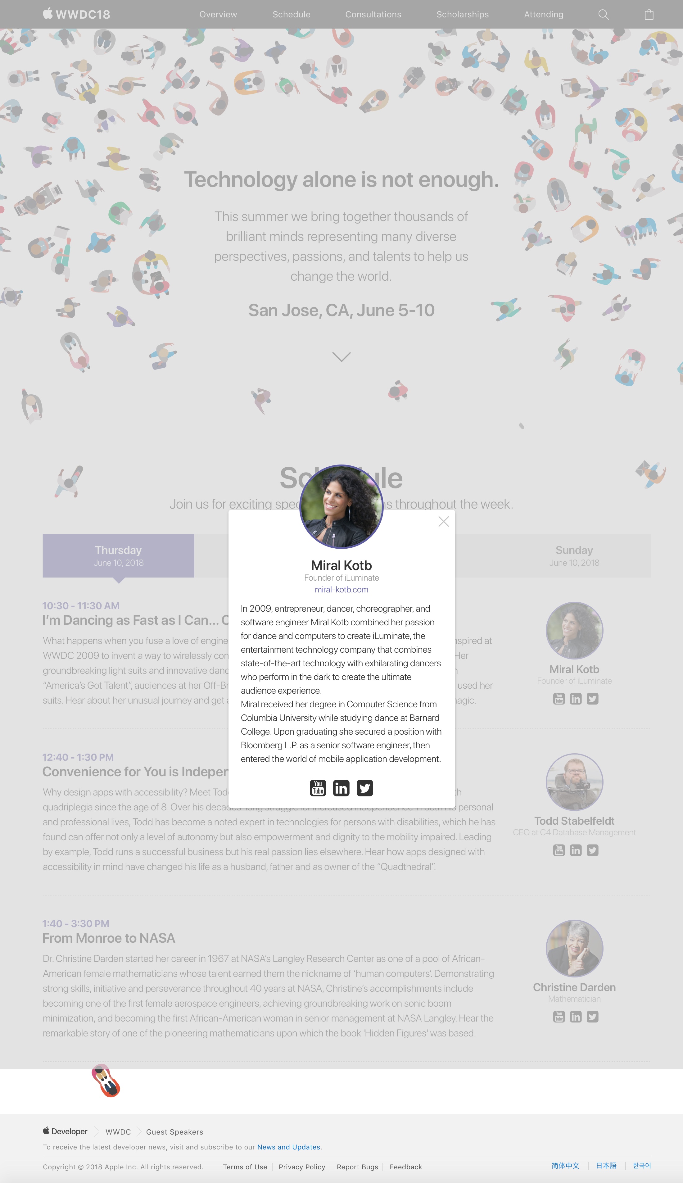
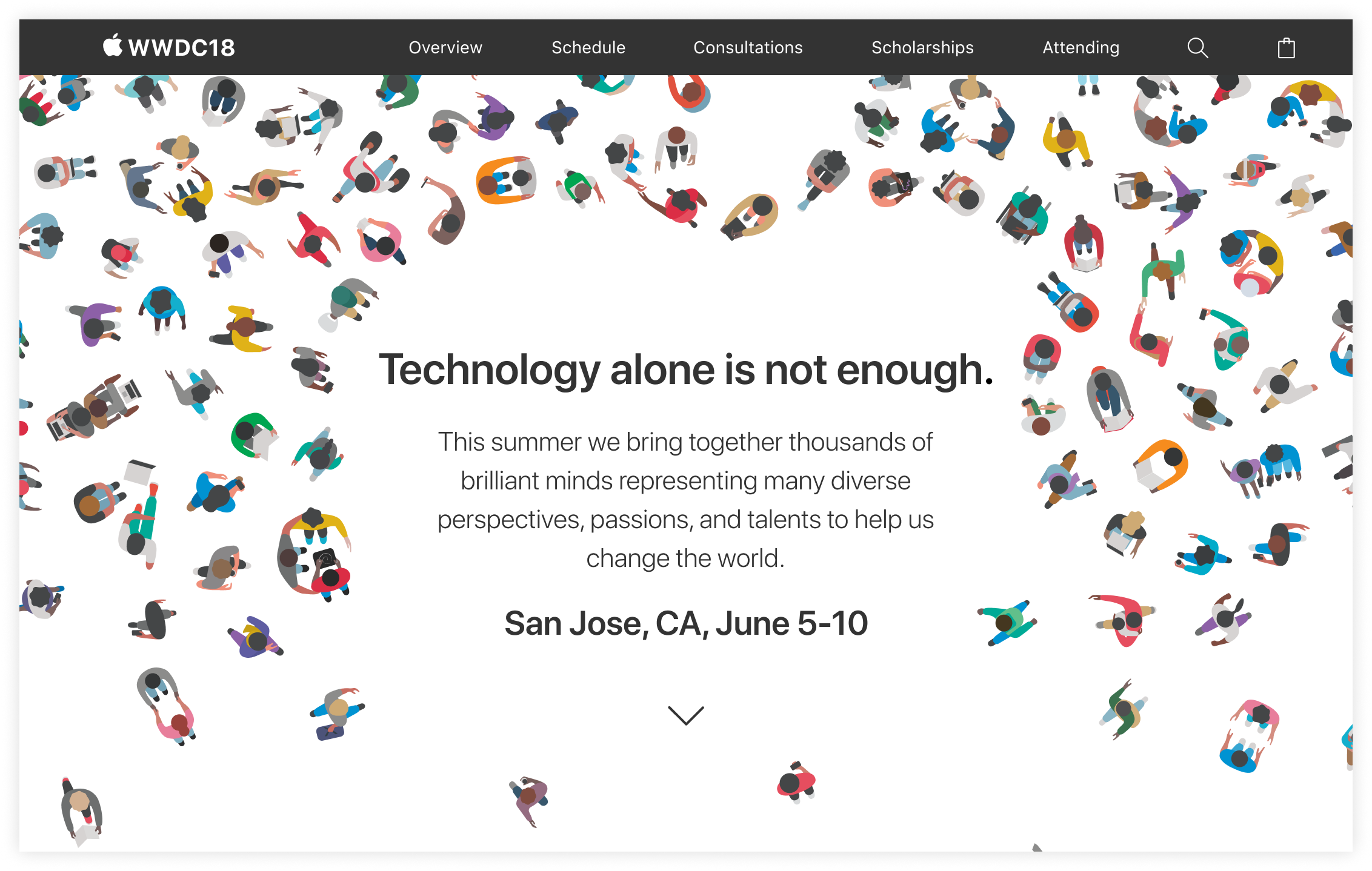
A landing page that focused users attention on the agenda, the speakers and the topics on each talk, keeping the style guide (visual and voice tone) from Apple products.
This design was presented along other 3 options from different designers. Aside it wasn’t selected, I’m proud of having this amazing experience and opportunity of designing for a big corporation.
