Buy and sell furniture easy and fast
Whoppah is the smart first-class marketplace for secondhand goods that will turn your house into your dream home. From art to the children’s room and from antiques to modern design. The first-class offering is always curated by experts. Discover Whoppah and be amazed by our treasure room’s unique items for your home.

The Challenge
To help people to commerce high-quality furniture safely.
Based on a previous analysis, we realized that current marketplaces from The Netherlands, don’t assure good quality of products or don’t offer Fraud protection, also they don’t focus on furniture. Users need to spend a lot of time and efforts to find good products in good conditions. For Evelien a Thomas, this was the motivation to create this platform.
“The market was there, but the product was missed”
Whoppah would offer a marketplace platform for second-hand interior items, to help the user to buy/sell easily without worry about the quality of the product.
By doing so, Whoppah stimulates reuse in the light of a sustainable way of living.
My Roll
Starting from scratch
I joined Whoppah in June 2018, when it was just a dream. My position inside the team (3 people at the beginning) was led the design of Whoppah APP interface across iOS, Android, and in the future the Web APP version.
My position was REMOTE, but we had a lot of online and in-person meeting.
Customer Insights & Ideation:
I had the pleasure to work directly with Whoppah founders, together we analyzed insights and translated concepts into features that address customer behaviors and motivations.
Design Execution & Validation
I designed across 2 platforms and collaborated with developers to translate product features. I executed journeys, wireframes, prototypes and design specs.
After the product was finished, I collaborated with testers to improve the visual and quality of the front-end.

Working with founders
The experience of working with founders means to be involved in the product 100%, learning all the aspects of the company: Business goals, how to raise investors, how to engage users, how to help users to achieve goals, and how to be a good colleague.
The hierarchy is flat, your ideas are recognized, You are an important piece in the big gear.
After we launched the product, I still working to improve the service and solve users pain‐points that are struggling the most. For this, we have an excellent qualified team of Data Analysis, developers and business developers to catch, analyze and improve features. But I’ll talk about improvements in another article.

Discovery
Research, the key for a solid product…
We ran a customer and market research to drive our planning phase. That give me a lot of customer insight and a guidance on where to focus the product and which features focus on.
Most of this material is protected with a non-disclosure agreement, so I have omitted confidential information in this case study.
The market
We did a market analysis to see if we had room to give to this product live. We found that the market was bigger than the expected. So Thomas took this approach: We don’t need to be everywhere, we are where our audience is. Test it and scale it
Competition
It is important to look into other players on the market. We analized on each one: User and products goals, and User Interface & User experience on differents flow (Onboarding, sign up, purchase/bidding process, etc)
Audience
We created our tentative user Personas. We divided in 2 main targets: Buyers and Sellers, and inside them 2 types of diffent personas.
We analyzed: Quantitative information, behaviors, expectations, paint-points.
Product
Based in the previous infomation we defined: product goals, product vision, “must to have” features, “out the box” features.
The Vision
Easy, fast, risk-free
The assumption was simple, millions of customers search online second-hand products, and most of them doubt to buy it until they see the conditions of the product.
For buyers finding good quality second-hand items for your home is a struggle
On the other hand, sellers are tired of time-consuming conversations and unrealistic offers.
For sellers is hard to get value for good quality items
We wanted to focus the product in solve these problems. So we decide to offer: curated products, top-brand products, 0% transaction cost for buyers/sellers, verification process for persons and merchants, “buy now” option and “bidding” option, chat-boots on bidding process, classic delivery and premium delivery.
We decided to do babies steps. So, first, focus our product in Amsterdam and when the product is solid “Make it grow”.

Design
When you think you’re done…. you’re not.
The prototype that you see below isn’t the final design. It’s the first one..
Working with data collected during the research phase, I was able to set up user flows which we reviewed with the team. After that, It was time to give shape to our product. Until here, we had around 6 months of work (including research phase).
My steps were:
- Create low-fidelity wireframes (on paper) the main objective was to create the product’s structure and define features. With the team, we had the opportunity to quickly plan and validate the value of of the design of a screen.
- Create a style guide to keep the UI consistent (colors, fonts, structure, basic components, etc)
- Create high-fidelity wireframing in this step I defined how a product will look at project completion.
- Create the prototype, before to move on with the development process we decided to make a quick prototype to validate the usability and overall value of solution design.
Design
Prototype Insights
After the prototype, we found problems with the homepage.
- We’re giving a lot of hyrarchy to styles instead of categories
- The illustrations didn’t work
- It feels that something was missed
The biggest challenge I faced throughout this project was balancing moving forward with designs, we spend a lot of time changing copy and images. Things that can be done in the development phase.
Managing feedback was even more challenging because developers weren’t involved in the design process, so when we presented the prototype to developers they realized that they won’t finish all the features at a time.
Thomas and Evelien wanted to do a complete re-design. The time was flying, and the design was not approved.
They decide to hire the marketing team “Neew”, to review the project and improve some part in a marketing perspective. They proposed to improve the homepage adding more colors, for that they made a series of photos session from products that represent each category.
The result was great!. Those images added the “Whoppah” felling.
After this we decided to hack and improve the interface in only 2 week. We already have the structure defined it was just change the styleguide and make some minor adjustments:
- Make a flat design
- Make it simpler
- Add the categories at the top in the homepage
- Take out some copy

The results
Introducing Whoppah
Whoppah is the smart first-class second-hand marketplace for your home. On Whoppah you can find and sell second-hand items, handmade items, showroom models and vintage design classics.
- The best quality. Always checked.
- Verified buyers sellers
- Secure payment via iDeal and delivered to your home


Discovery
The main page allows the user to explore the app. If the user is logged in we show recommended products based on their preferences.
Also, “new in”, banners regarding “buy safely”, products grouped by styles and categories.
And the possibility to see what other users are offering near to the user’s location.
Search easily: type in a search term or upload a photo
Login only if you want
The interface not require user authentification to explore the app. That gives the user sensation of freedom.


Buy now or negotiate?
The flow is designed so it’s easy to but ot bid with just a few clicks.
Also, everything is happening at the bottom of the screen which makes the process intuitive and user friendly.
Before buy, you can view the product’s video, images and the complete attributes.
The powerful chat
All the contact between users, payments, and delivery happends directly in the chat.
The user can pay quickly and securely via iDeal. Choose between pick up your purchase and have your product in 1 day (delivery premium), or have it delivered with PostNL.
The seller will only get paid after the buyer received the product


Adding a new item
To list an item on Whoppah, all you need to do is take a video or a photo (this screen has Whoppah tips to make them great!), and after fill in the item’s details, description and your “buy now” price.
Once you hit “Publish” your submission is reviewed and curated by the Whoppah team.
You profile
Every user on Whoppah has 2 types of profile. The public profile list some basic user information and all the product the user sells. That is great to share with friends and colleagues.
Also, each member has their own private profile, where the user can manage everything related to adverts, payments, personal information, and user verification.


The tools
How I got here
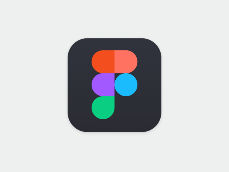
I made the design and manage the requerirement using diffent tools. But I would like to highlight Figma (Clap! Clap!).
Before this project, I used Sketch with a lot of plugins installed to have complete software working.
When I started to work with Whoppah, one of the requirements was to use Figma. I was opposed to it, but I was wrong.
Figma is the most powerful design software that I knew. The main benefits is that is a live collaboration tool. It keeps teams on task and encourages full disclosure, essential when building a design system for a variety of disciplines. Figma is easy for anyone to use on any platform, and lets teams share their work and libraries quickly, add comments, export styles, and is very easy to make quick prototypes with it. I just love it!.
Other tools that help me to make this project live are: Photoshop (to edit images), Jira (tasks manager), and Google Hangouts Meet (for team communication)


Retrospective
We created the minimal viable product. What now?
After a year of design and development, we launched our first version available for Android and iOS. Customers now have the power to buy and sell 2nd hand furniture from their phones.
We had finally created the minimal viable product for our customers, and it was the time to get insight, learning and iterate over our product. For that, we set campaigns with UX CAM, Google Analytics, and Confluence to analyze how our users interact with the app.
Launching is only the beginning
We’re humans, and part of the products are based on assumptions, some of them created based on the research, competence analysis, and others, based on the personas and the user we want to reach.
When we launch the product it was time to validate (or not) all these assumtions. I mean:
- If these assumptions were correct.
- If we pushed in the right direction?
It was important to get insight of these facts to improve and focus our project to a specific part.
You can see the learning we get in the project “Whoppah! We got learnings”